
Have you ever felt your Midjourney art looks flat, like a dusty snapshot instead of that big-screen spectacle? The AI’s smooth hum is there, but your colors just aren’t singing, you know?
No worries. We’ll show you how a quick round of color grading can add instant drama, and slash your post-edit time in half.
Here’s the three-step magic:
- Seed your prompt with hue tokens (simple color hints).
- Blend in a winning palette with SREF (style reference files).
- Finish off with LUTs (lookup tables that map colors) and tone curves to lock in the mood.
By the end, you’ll turn AI’s quiet buzz into a vibrant glow that literally stops scrollers cold. Ready?
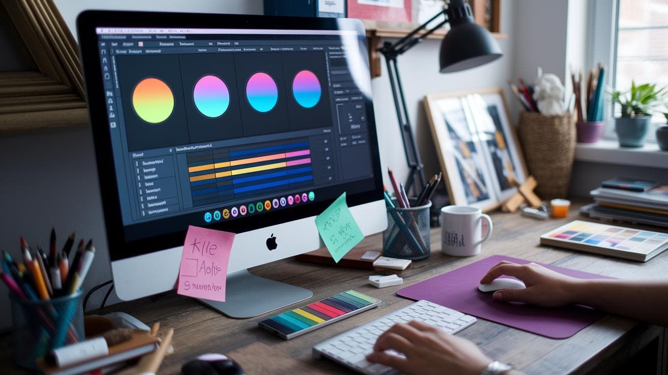
Core Color Grading Workflow for Midjourney AI Art

Have you ever wondered how AI artwork gets that cinematic glow on color? We break it into three friendly phases: prompt crafting, palette blending, and post-render polish. It’s like seasoning a dish before it even hits the oven.
-
Prompt formulation with hue tokens
- Drop in hue tokens (color keywords like "golden-hour orange" or "deep emerald") to guide the AI’s color palette from the get-go. Kind of like picking out your paint swatches first.
-
Palette import via SREF or image reference
- Add a palette image or paste a URL into /imagine with –sref (style reference) or set an image weight. Midjourney will pull in your chosen Adobe Color schemes.
-
Midjourney parameter adjustments
- Tweak –stylize (style strength), image weight (palette dominance), –ar (aspect ratio, or frame shape), and –seed (starting point for consistent results).
-
Post-processing with LUTs and tone-curve refinements
- Upscale your draft, then apply LUTs (lookup tables, preset color adjustments) or a dual-tone effect. Finally, nudge tone curves in Photoshop or Lightroom for a polished, cinematic finish!
In reality, following these steps tunes the quiet hum of AI algorithms to your creative mood board. You’ll spend less time in post and more time making art that turns heads.
Color Theory and Palette Creation for Midjourney Generative Art

Have you ever noticed how some color pairs practically leap off the screen? Complementary colors sit opposite each other on the wheel – picture a rich navy blue set against a fiery orange sunset. That contrast sparks visual energy and gives your art a bold, cinematic punch.
On the flip side, analogous schemes stick with neighbors on the color wheel. Think soft teal sliding into gentle green and then into light blue. It’s like waking up in a foggy forest dawn, calm, unified, and oh so soothing.
Here’s a neat trick: mix harmony rules in your prompts to shape the mood. Throw in complementary tokens for drama, then follow up with analogous tones when you want things to feel smooth. Just naming those relationships in your color tokens tells Midjourney whether to crank up the contrast or dial it back for a gentler vibe.
Ready to build your own custom palette? Head over to Adobe Color and pick a harmony rule – complementary, triadic (three evenly spaced hues), or analogous. Next, choose a base hue you love and tweak each swatch until it feels balanced. When you’re happy, click export to download that little palette image.
Finally, upload or host your palette image so you can reference it in Midjourney with the /imagine command. And here’s a pro tip: add a black swatch in one corner. Black works like a brake pedal, pulling back any runaway brightness and keeping your renders grounded and realistic.
Prompt-Driven Palette Integration in Midjourney AI Color Grading

Have you ever wished you could pick a color palette as easily as tapping a filter on your phone? With style references (SREF) in Midjourney, you do exactly that. You just drop in a link to a hosted palette image, and the AI grabs its hue map before it even starts sketching.
Um, it’s like painting with a magical brush. You can feel the quiet hum of colors blending under your prompt. Next, you mix soft pastels with deep shadows in one go, without endless manual tweaks.
Using SREF for Color Grading
To try it out, use the --sref flag and paste in one or more palette URLs. For example:
/imagine prompt "misty forest at dawn" --sref https://example.com/palette1.png https://example.com/palette2.jpg --ar 16:9 --s 200
Here’s what’s happening:
• --sref turns on style reference mode
• Two URLs layer two grading styles
• --ar 16:9 gives you a cinematic frame
• --s 200 keeps the stylization balanced
Then you can swap or add URLs anytime. It’s kind of like remixing colors in a digital paint shop.
Adjusting Image Weights
Let’s say one palette feels too bright and another too moody. You adjust that by adding ::weight (0.1 to 1) after each URL.
For example:
• https://.../palette1.png::1.0 for full-bright color
• https://.../palette2.jpg::0.5 to soften that look
Lower weights pull back extra saturation and strange color shifts. You can also drop in simple color words, like emerald or rust, to nudge the hue. And if you spot any unwanted tones, use --no orange to banish them.
It’s a bit of an experiment, you know? You tweak weights, swap URLs, mix in hue words, and soon your drafts will hit just the right mood. In reality, it’s all about playing around until it feels perfect.
Midjourney Parameter Settings for Precise Color Control

Tuning your Midjourney colors is kind of like tweaking the knobs on a vintage stereo, just the right tweaks bring everything to life. Here are the key flags I play with to get crisp, balanced hues.
| Flag | Range | Purpose |
|---|---|---|
| –stylize | 100–300 | Controls how much artistic flair you get, higher means more style, lower keeps it grounded. |
| –stylize raw | n/a | Keeps your image honest by avoiding extra stylization. |
| –image weight | 0.5–1.0 | Sets how much the AI leans on your original palette (0.5 is subtle, 1.0 is full-on). |
| –seed | 1234–9999 | Locks in a starting point so you can recreate the same look later. |
| –ar | 16:9 | Gives you that widescreen, cinematic feel. |
| –v | 6 | Sharpens up color separation for more distinct tones. |
If you ever notice odd polygons or patches that look way too saturated, just lower the –stylize value, or hey, try adding the –stylize raw flag.
Post-Processing Color Grading with Photoshop and Lightroom

Have you ever marveled at how a small, 512px AI draft can turn into a big, vibrant canvas? First, when your Midjourney image looks crisp on screen, export it at the highest resolution you can. Then lock in your seed value (that’s the number that keeps your AI’s random magic consistent). Next, feed the file into an upscaling tool like Topaz Gigapixel or Photoshop’s Super Resolution (software that boosts image size). Imagine a smooth, humming process that transforms a tiny sketch into a 2048px masterpiece. You’ll see every digital brushstroke pop.
Now, import that high-res draft into Lightroom or Photoshop. In Lightroom, start by adjusting white balance (the color temperature of your image). Lift the shadows to reveal hidden details, nudge the highlights for a brighter feel, and even try split-toning, adding two color tones for mood. Then open the tone curve panel. With a gentle S-curve, you carve in contrast: velvety blacks and juicy midtones. This pre-graded version is your springboard for more hands-on tweaks.
| Preset Name | Primary Adjustment | Application |
|---|---|---|
| Cinematic Teal-Orange | Dual-tone LUT | Vibrant scene pop |
| Vintage Film Look | Grain + Warm Fade | Retro ambience |
| Pastel Tone Fade | Desaturated Curves | Soft mood |
| Neon Glow Boost | High-Saturation Mask | Futuristic accents |
| Monochrome High-Contrast | Black-White LUT | Graphic style |
Switching over to Photoshop? Cool. You can layer in those presets and then fine-tune with the tone curve. Use adjustment layers for each LUT, flip blending modes, dial down opacity if it feels too wild. You might stack hue/saturation layers or grab Color Range selections to zero in on tricky spots like neon signs or fluffy clouds.
Grouping helps. I name mine by function: highlights, midtones, shadows. Then I can click through and tweak without guesswork. Need to isolate a sky or smooth skin tones? Paint on a mask and you’re golden. And here’s a trick: turn layers into Smart Objects. That preserves original pixels so you can slap the same LUT across multiple files. Want a soft color wash? Add a soft light layer, then mask out anything that looks overcooked. It’s non-destructive, so you can always roll back a color tweak or swap a LUT without losing your work.
Cinematic Tone Mapping and Contrast Strategies in Midjourney Art

Ever wanted that big-screen look in your AI art? Picture rich, moody colors flowing across the frame like a film still. These prompt flags let you nail film-style grading and framing in Midjourney.
| Flag | What it does | Example |
|---|---|---|
| –ar | Sets aspect ratio (the shape of your image, like widescreen 21:9) | 21:9 |
| –s | Adjusts stylization strength (how much Midjourney’s style shines through) | 750 |
| –v | Chooses the engine version (the AI model you want to use) | 5 |
| –sref | Applies style reference URLs (grab a look you love) | https://example.com/grading.jpg (multiple allowed) |
You’ll see hands-on examples in the prompt-driven palette integration section. And if you need step-by-step tips on boosting dynamic range (the gap between bright and dark), carving an S-curve (a simple contrast boost), or using black swatches to ground your deepest shadows, flip over to our post-processing color grading workflow. Incredible.
Ready to roll? Dive in and watch your art transform.
Portrait Render Grading Steps: Before-and-After Example

Real-World Case Study
Have you ever seen a dreamy photo that feels kind of flat? That was our first try. We asked Midjourney ai (software that learns from data) for a 35mm shot of a woman in white streetwear on analog film, with a pink-and-mint color wash at 4:9 ratio, stylize 50, version 6. It looked soft, but the mint wash drained the shadows, the pink highlights sunk into the midtones, and the whites just didn’t pop.
So, we ran our Core Color Grading Workflow. First, we tweaked prompt-driven palette tokens – little hints that guide color choices. Then we locked the seed (the magic number for repeatable results) and nudged up the stylize value to sharpen the look. Next, we jumped into post-processing: we added a teal-orange LUT (a color preset), refined an S-curve (it cranks up contrast like a volume knob), and masked skin highlights so they’d glow just right. The result? A portrait with layered colors, crisp whites, and a moody, cinematic vibe. Want the full breakdown? Head over to how to create realistic portraits with Midjourney ai
Final Words
Jumping into the workflow, you tackled prompt formulation with hue tokens, imported palettes via SREF, adjusted stylize weights and seed values, then polished images in Photoshop or Lightroom.
You also explored basic color theory, built Adobe Color palettes, and embedded them in prompts for richer moods.
You mastered parameter tweaks, stylization, image weight, aspect ratio, and added cinematic tone mapping for dramatic depth.
A portrait example showed how simple prompt fixes and post-processing yield crisp color separation and consistent mood.
With these color grading tips for Midjourney ai art, you’re set to bring out the best in any AI render, keeping things vibrant and precise.
FAQ
What are the best color grading tips for Midjourney AI art?
The best color grading tips for Midjourney AI art include using hue tokens in prompts, importing palette images via SREF, adjusting style weight and seed, then refining with LUTs and tone curves in post.
What is the best AI color grading tool?
The best AI color grading tool depends on your needs, but popular choices are DaVinci Resolve’s neural engine for smart adjustments, Adobe Lightroom’s AI presets, and 3D LUT Creator for precise tone mapping.
How do I get better at color grading?
Getting better at color grading means learning color theory basics, studying real-world film or photo references, practicing with curves and LUTs, and inviting feedback to refine your style over time.
What is the best format for color grading?
The best format for color grading is a 3D LUT (.cube) for broad app support. OpenEXR files also preserve high dynamic range during grading before export.